I am receiving way too many emails with subjects like Re: Re: Re: The logo should be more blue-ish
Since constantly facepalming is no way to live your life I tried a lot of tools to improve communication. Comparing them should be done another day, but Trello is something you will definitely stumble across during a search like this.
Here I simply want to mention a few things that the Trello Team does really well and with an incredible amount of focus on User Experience (UX).
I mean... I regularly feel hugged by the Trello UX team.. is that really just me?

Ermm, nevermind.. presenting:
Ten Trello Tidbits or Why Their UX Team Deserves a Hug
Trello features a "Board has many Lists has many Cards" concept and therefore is really flexible, but no unique tool snowflake. But it's the details I want to draw your attention to:
The Batch create Card and Todo feature
One of the things I more or less noticed by accident is a "batch create" feature. You can literally drop a bunch of text into the "Add todo list item" input field and Trello will create a new item with every line break. Woha!
The same thing works with the creation of cards, though you will be asked beforehand. This is a feature that has recently landed in some todo applications (Check out Todoist my app of choice) but Trello is the place I saw it first.
Intuitive keyboard navigation
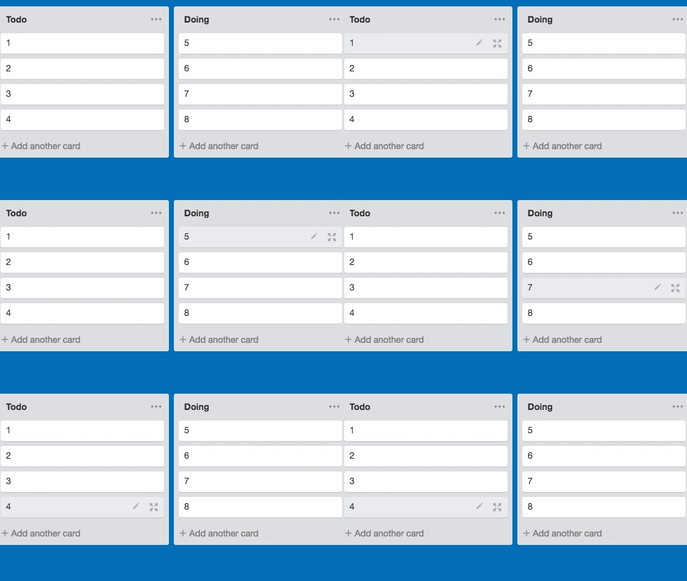
I know that I am a little too much into shortcuts. I admit it. I spend hours learning shortcuts that will maybe save me 5 Minutes a year. But the good thing about Trello's keyboard navigation is: There is hardly anything to learn. Want to navigate "Down" ? Press "Arrow Down". Want navigate right? Do a handstand! ... No, just press "Right Arrow".
I know this stuff sounds simple... but if it's so simple why do most tools neglect this? Why can't I navigate my cards or tasks in other applications with the keyboard arrows? Okay, let's be a little bit more helpful than grumpy:
- N New Card
- D Set Due Date
- E (Quick) Edit
- F to search a Card
Shortcuts can be so easy. Check Trello's Shortcut Page for more info, you'll be surprised.
Since the whole point of this article is to mention little UX gems: Pressing "Right Arrow" does not even take you to the list right of you, but also to the corresponding nth card in the list.
I find this attention to detail impressive and inspiring 😊
Notifications and fighting E-Mail SPAM
Most Applications either inform you too seldom about important changes or bombard you with emails by default. I have seen coworkers simply marking all emails coming from a tool as spam since it was too complicated to find the settings.
At Trello, the team really has put a lot of thought into their notification and email system to not make them loose significance by sheer mass. There are three simple options for E-Mails:
- Send me E-Mails as fast as possible
- Send them once per Hour
- Don't send me E-Mails at all
There are no "E-Mail Schemes", no "call your admin to change this", no nothing overly complex for normal users to understand.
This simplicity is key, because:
Even the best tool will loose all it's power when not understood and ignored by less technical team members
The emails are only send when you are "notified" inside of Trello. It is therefore worth to mention, that the notification system absolutely makes sense. You'll get notified if:
- You are mentioned
- You are watching cards (issues) activity
- You are watching the whole board (project)
The notifications don't jump into your face, they are hidden behind the "Bell Icon" right next to your accounts image.
Flexibility and easy to learn for everyone
Needless to say, flexibility is one of the biggest strengths Trello has. The "Board List Card" principle can be used to represent almost anything. Most commonly though, it is used in a Scrum or Kanban-ish way, where the lists represent things like "todo" "doing" or "backlog".
I've also seen people use (and myself used) Trello for the wildest things. An interesting example is to create cards to organize the people in your network to improve relationships with them.
The possibilities are endless, and flexible, this is why I am a big fan teams using Trello to move fast and find their very own workflow.
This is way more important than any tool, and Trello's habit of not getting into your way helps you immensely. After all:
Finding a right workflow is way more important than the tool used to implement it
Create cards via E-Mail
A nice feature is the fact, that every board comes with a dedicated email address. When you are the poor person in charge of client communication, you can simply send a task from a conversation to a board.
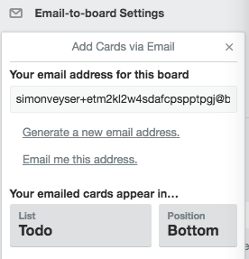
And even if I repeat myself: I am not saying this feature is perfect, it becomes quite confusing at times to have a long blob of text in there. I am just saying that the idea is really good and it is cool how much energy and thought has been put into things like this.
Speed & Background Saves
There is not even the slightest indicator of loading time. I've worked with the Trello REST API and I know that it is not the fasted interface ever invented.
What I am trying to stress here is, that the perceived performance is incredible. You almost don't notice that your actions are saved in the background. Even if you don't save your changes, drafts of comments or cards will be persisted so you don't loose something accidentally.
This approach can be found in many apps nowadays, but Trello gives me the most confidence that my changes will still be there.
Smartphone Apps
The UI/UX of Smartphone Apps is a world of it's own and I will not cover anything about it here. I simply want to mention, that I was absolutely happy with the Android App.
It's even partly possible to work offline, your changes will be merged later.
I must say, that I found the notifications a little annoying but that could be my personal preference since I tend to disable all notifications.
Search and filter cards like a pro
Something I grown to like more and more over the last month is the awesome search function. As a Developer, I love fuzzy search working to different degrees in most text editors or IDEs. You just type something you know is contained in the File or Command you want, and voilà, the thing you look for and the closest other matches are found.
The Trello team must have put some serious effort into their own search and filter function because it works quite similar. You can type words that are contained in a card, regardless of their order, case and board they are on.
There are special commands you can use, all of them documented here. As an example, you can use @me to only show cards assigned to you.
The last awesome thing to mention is the fact, that you can even chain things like a search phrase, the name of a board and the command to show only cards assigned to you. Combine this with keyboard shortcuts, and you have a cool workflow to find relevant cards.
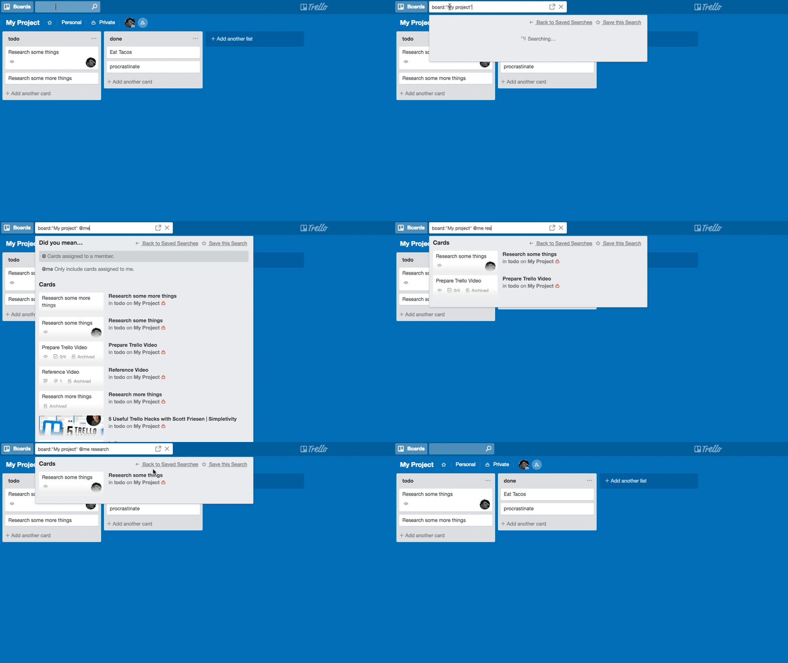
It's worth to mention, that search is intended for a search across all boards, filtering works only in the current board.
The documentation is spot on, right beneath the search of filter function all possibilities are explained.
Integrations and powerups
To be frank I did not use too many Powerups since the tool already has so many things baked in. But there is a ton of things you can add to a board to add functionality you might miss. A prominent example is a calendar to show all your due dates, but there is so much more.
I recently used a Powerup that indicated the age of cards by making them more transparent when there was no activity for a longer period. You also can integrate almost any service, add custom fields, repeat actions and so much more.

It's the little things
There are so much more little features that make me smile every day and that are the main reason I wrote this article.
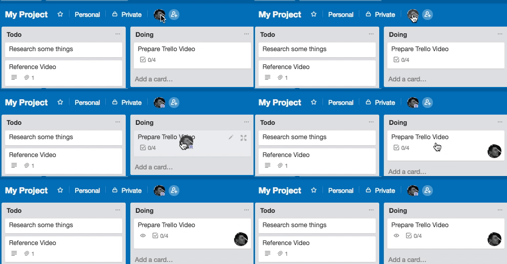
You can drag the avatars of the board's members onto cards
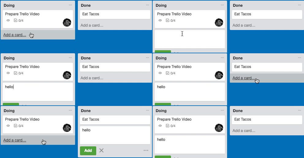
You can start writing the title of a new card in one list, and then finish it in another
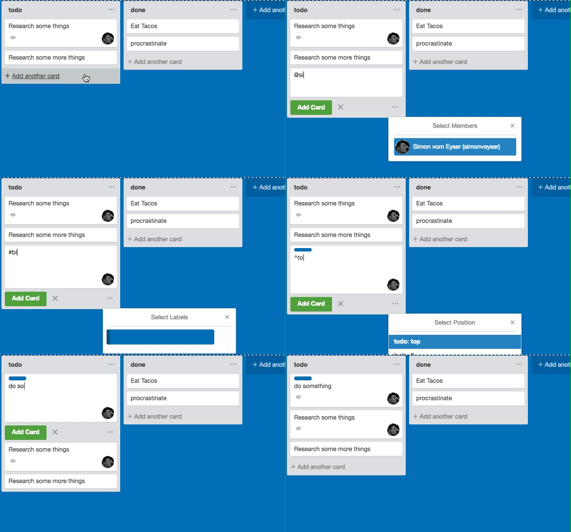
Use things like @name, #label or ^position while creating cards to assign people, labels or position a card during creation. Details are at the bottom of the shortcuts page.
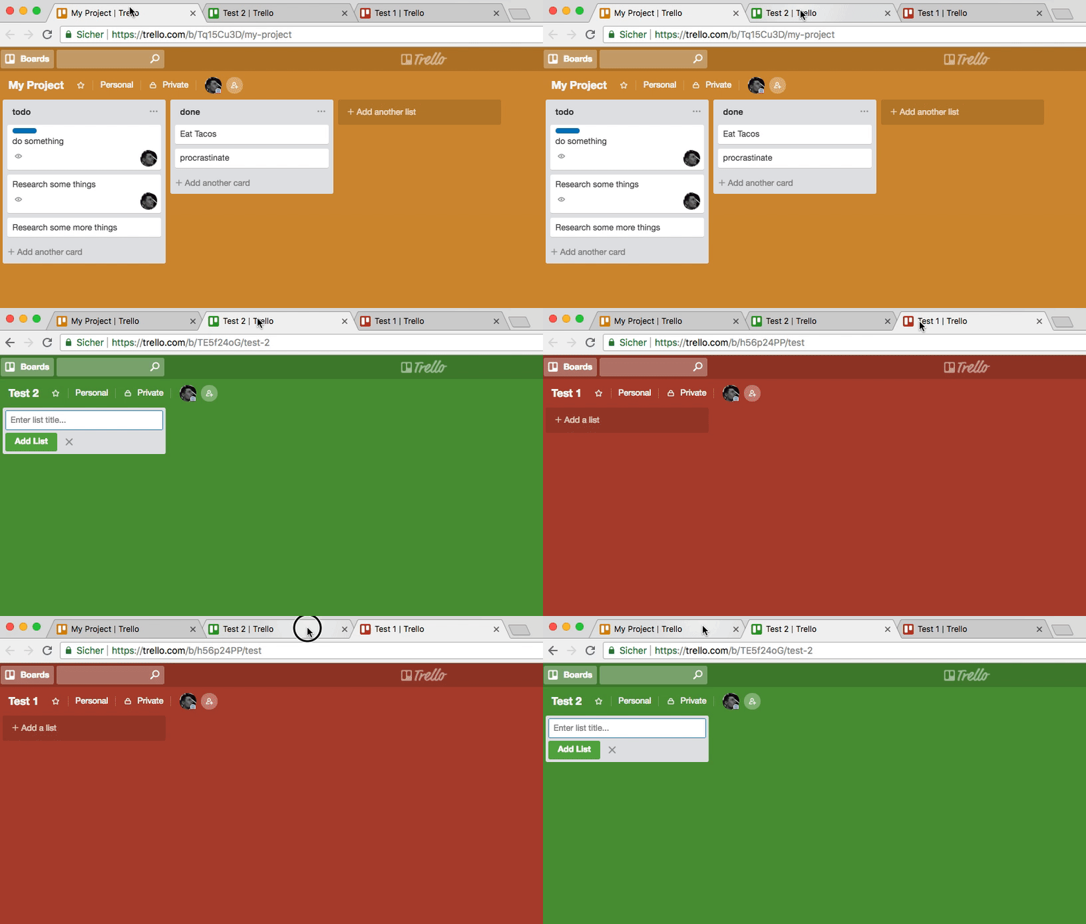
The color of your board or the chosen background will by shown as a favicon in your browser tab.
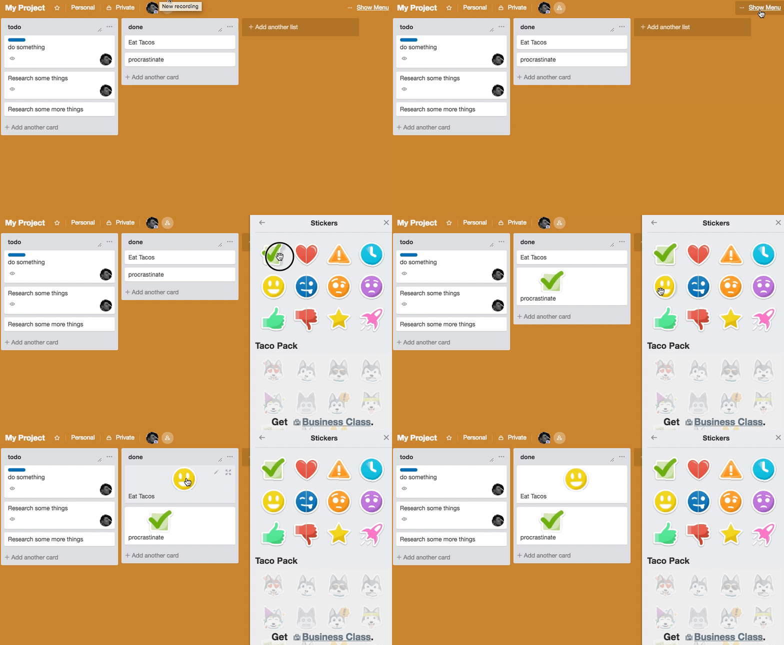
You can use stickers and attach them to cards to make everything more colorful
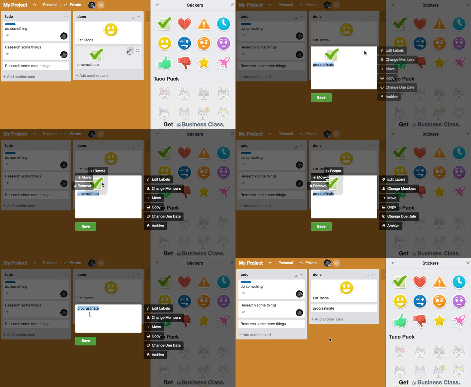
And just to critizise something to a change: How to alter or remove stickers is something, the UX team has not found the perfect solution for.
Last words
That's a lot right? And just to be clear, I am not saying trello is the best tool for every purpose. But most tools, while clearly having advantages for certain use cases, lack these seemingly simple features!
Why isn't my todo list app able to keyboard navigate, why is the project management tool at a company I work for not auto saving my comments drafts?
I am not trying to disrespect the work other teams do - there are amazing applications out there. I just try try to inform and maybe inspire about things I found to be really helpful 🙂.
So let's all be friends and hug each other more often like the Trello UX team does with it's users!
How to test static pages automatically in Laravel
I developed a way to automatically crawl and test big parts of your Laravel application.
With just one line of code, you can now write a "peace of mind" test that gives you a lot of confidence.
Your Tool is not the Problem - Your Workflow is
A few (meta) thoughts on the search for the best project management tool.
Usually, the chaos you'll find in a software is a quite accuarate representation of your teams' communication skills - and also a big chance for improvement.


 Say hello!
