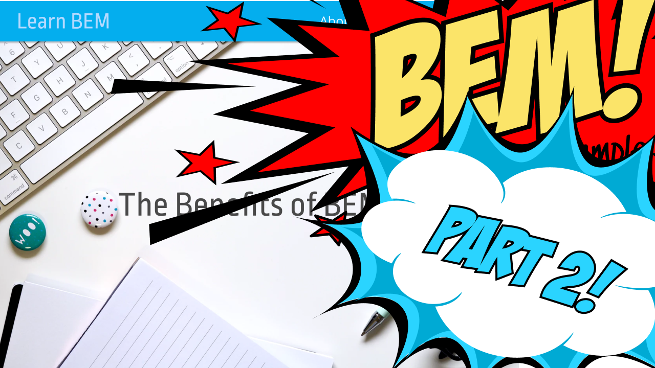
Howdy ho and welcome back! This is the second part of my BEM by Example series. If you skipped the first part make sure you at least know what that core concepts of BEM are.
In this post we will setup the project and then (finally!) implement the header of the Design.
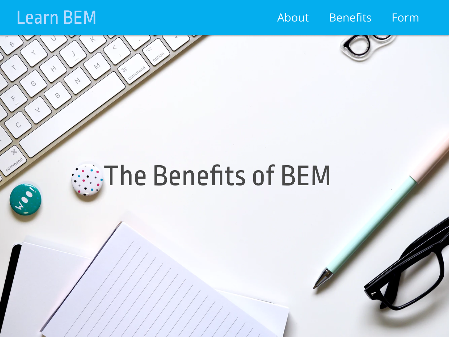
This can be found on Figma, where you can get the exact colors and export assets. Here is an old school image if you want to travel the old-school road.
You can of course use your own colors, background images and logos!
Alongside of this tutorial you will find some boxes like the one after this paragraph. In there I will mention things that are not necessarily important, yet interesting additional information.
If you have no idea the title of the aside means you can simply ignore it to not get confused. Nothing mandatory here.
Cool eh? I will contain some additional information for nerds.

The first steps
The first thing I would do when a designer hands my such an amazing design like the on above is.. maybe hug him or her. Designers need a lot of love because they get picked on for constantly drawing unicorns. 🦄
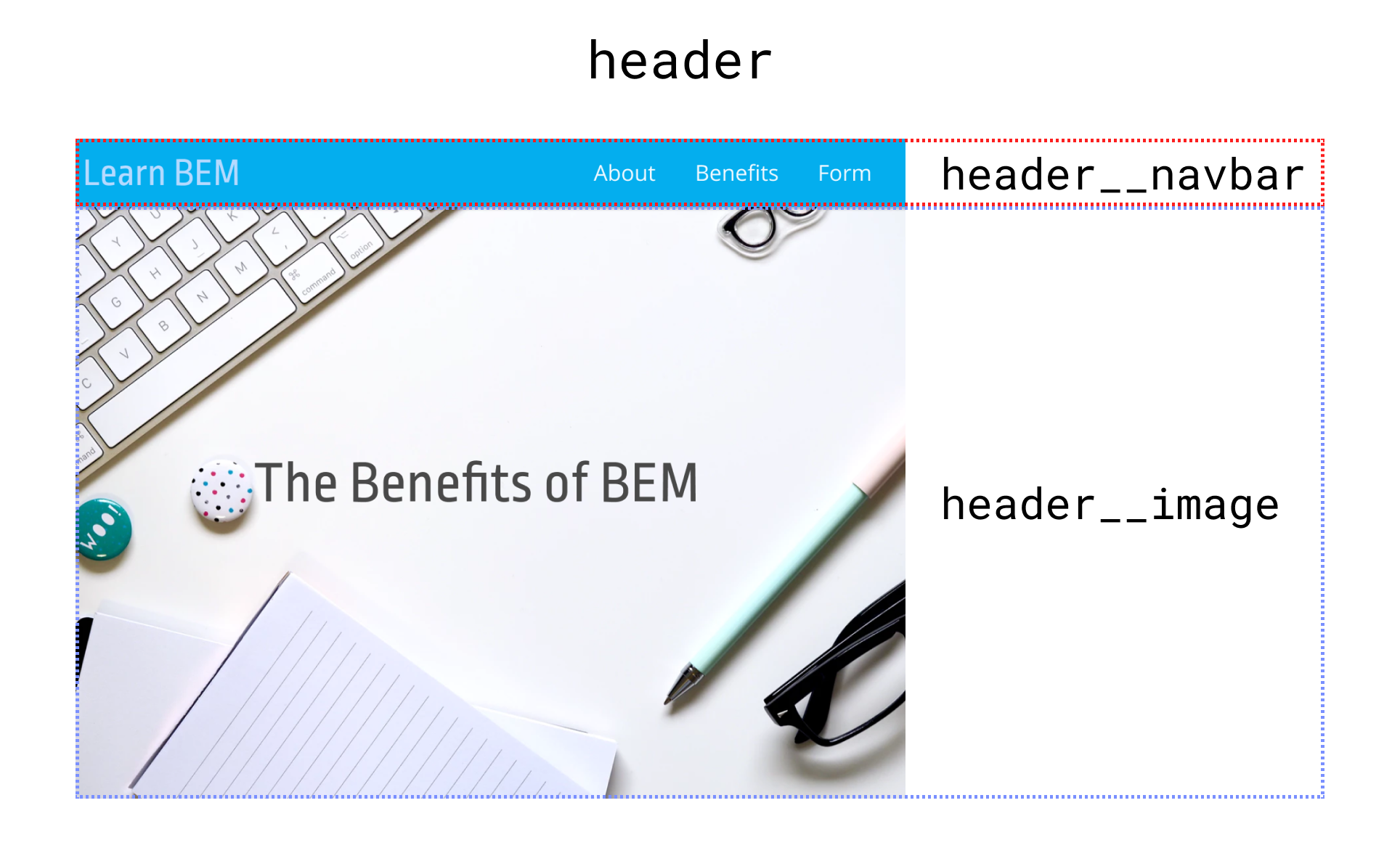
The second thing is trying to dissect the design and find our first "Block"!
My attempt would maybe look something like this video. You can do that on a piece of paper or simply in your head:
So you see I think we'll seem to need a Block named header with two Elements, a navbar and an image. This might change during implementation, my workflow usually involves refactoring later because I am not the sharpest tool in the shed. But in all seriousness:
Refactoring is always part of the process. Relax, nobody gets naming and hierarchy perfect right away.
Before we start to create a rough draft of the HTML we need to setup a project of course. No worries, this will be really down to earth.
The minimal project setup
Since we want this example to be as straightforward as possible we are going to use no CSS preprocessor, no Webpack, no gulping-grunts.
If you have no idea what I am talking about: Just keep in mind that most modern projects usually will have a more complicated setup.
Since this has no benefit for understanding BEM we can simply start with a single HTML file and a single CSS file. The way frontend web development used to be ... member? I 'member.

The HTML file needs a few things that are a recommended minimum for a modern website. We then include the stylesheet and are set in terms of our markup preparation.
<!DOCTYPE html>
<html>

<head>
    <title>BEM by Example Part 2</title>
    <meta charset="utf-8" />
    <meta name="viewport" content="width=device-width, initial-scale=1">
    <link rel="stylesheet" href="app.css" />
</head>

<body>
    <!-- Lets bemgin here (🥁 tss) -->
</body>

</html>
Now it's time to look at the basic styles!
Style prep, Global Styles and BEM
What to prepare before writing my first BEM Block was a big head-scratcher for me.
BEM Blocks should be independent, so should there be global styles at all?

This is the first time I will turn in my alter ego "Pragmatic Man" and hope you will like him and his sidekick "Common Sense Kid":
I prefer to use a few minimal global styles as a setup even if that means not fully complying to the BEM principle of complete Block reusability.
@import url('https://fonts.googleapis.com/css?family=Open+Sans');
@import url('https://fonts.googleapis.com/css?family=Ropa+Sans');

html {
  box-sizing: border-box;
  font-family: "Open Sans", sans-serif;
  font-size: 16px;
}

*, *:before, *:after {
  box-sizing: inherit;
}

body {
  margin: 0;
  padding: 0;
}
As you see these defaults are pretty minimal. I am setting a bigger font-size and defaulting to a prettier font which I imported. I am also setting the box model. You could do all that on every component but I think it's just not practical.
Let's not argue about stuff like that. It's simply not that important.
For me, BEM is more about structure inside a single project than about reusability across projects.
I am not using any resets because I think the arguments of the creators of BEM are quite good. You could though, I don't judge.
While it is totally possible to use a BEM naming convention and also use a CSS Framework (I did it quite often because they help a lot) I nowadays would prefer not to.
Your markup will stay way more concise since you will only use one naming convention and not mix it up.
Something like this using Bootstrap 4 just does not appeal to me and is messy and confusing because it mixes naming conventions:
<header class="header mx-auto p-3">
    <div class="header__navbar bg-light">
        <nav class="navbar navbar-expand-lg navbar-light">
            <!-- ... -->
        </nav>
    </div>
</header>
Still, if you want to use Bootstrap's (or some other Frameworks) immense power just do it. If it brings you more benefits than problems you already have your decision.
What's most important is getting to work, so let's do that!
Getting to work
The code I am writing can be cloned from GitHub. If you ask yourself "What the hell is a GitHub and I hated the Clone Wars Star Wars movie" - don't sweat it, just download the project files in a ZIP here.
After the setup in the last chapter we prepared the content of the part-2/begin folder. Starting from there we will make changes until we arrive at the content of the part-2/end folder. You can now try it yourself or just follow along with this tutorial, both is fine :)
What I like to do first is to create the markup from the rough ugly video I showed you above. It is important to go step by step from the outside to the inside.
So, our next steps would be to include the stylesheet in the head and then write a simple markup like this, one block with two elements:
<head>
<!-- other header stuff -->
<link rel="stylesheet" href="blocks/header.css">
</head>
<body>
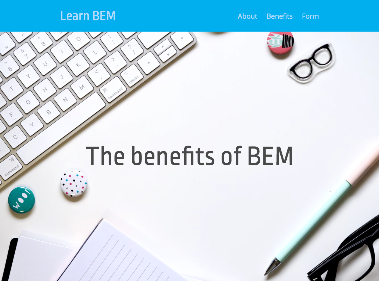
<header class="header">
<div class="header__navbar">
<!-- the next block will go here -->
</div>
<div class="header__image">
The benefits of BEM
</div>
</header>
</body>
</html>
Are you still following? Just don't care about the navigation (the next block) right now and look from the outside to the inside.
Always look at blocks in isolation is the key to not get confused!
After grabbing the image in (from a Figma export, from here or any other nice image from Unsplash) I would only style the header.css as shown here:
.header {
  height: 100vh;
  display: flex;
  flex-direction: column;
}
.header .header__navbar {
  background-color: #04AEEE;
  height: 110px;
}
.header .header__image {
  flex: 1;
  background-size: cover;
  background-image: url(../images/header-hero.png);

  display: flex;
  justify-content: center;
  align-items: center;
  font-size: 64px;
  color: #494949;
  font-family: 'Ropa Sans', sans-serif;
}
The markup in combination with the styles does result in something that is already going in the right direction:
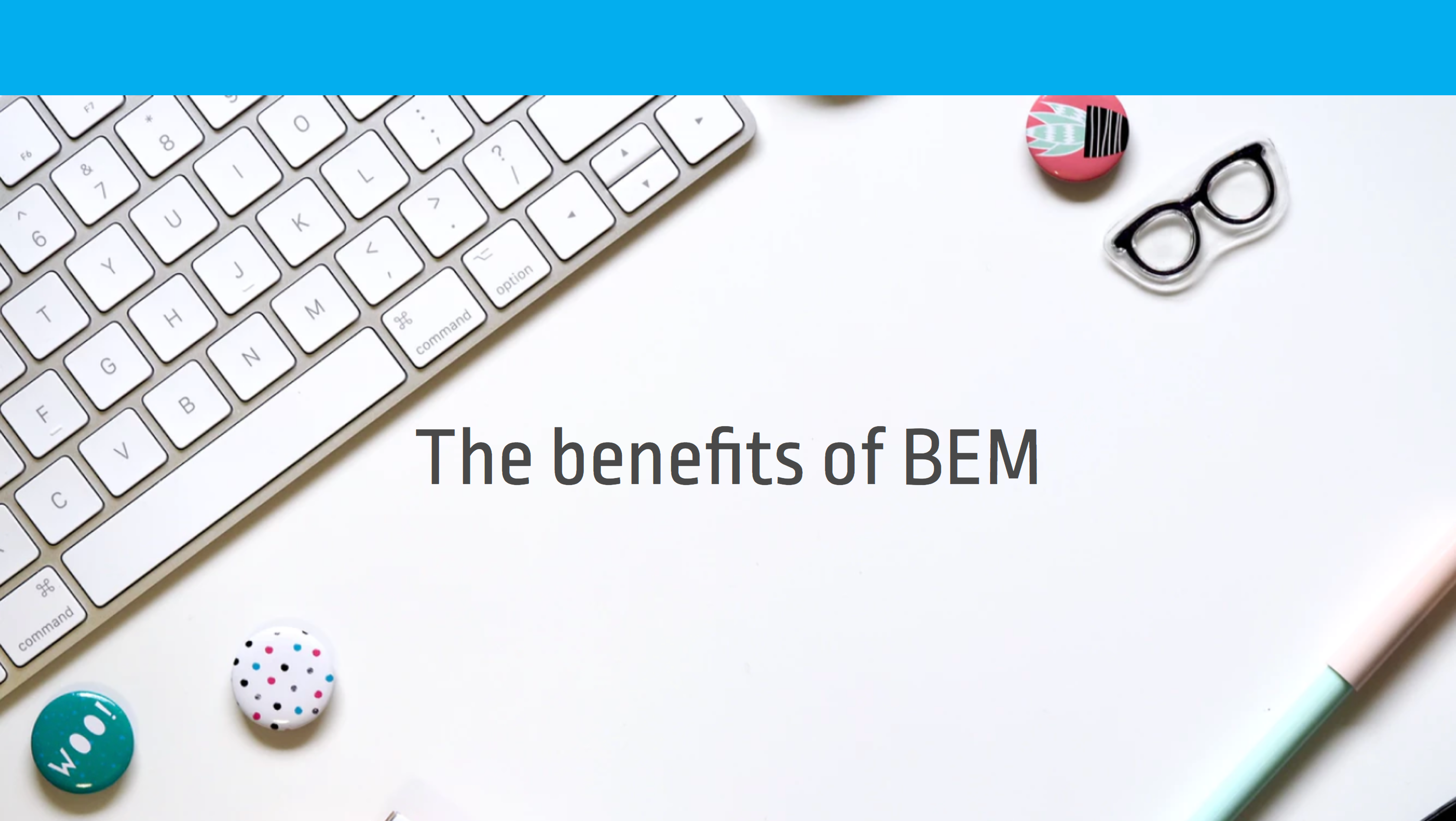
Pretty good right? You could use another Block or Element for the big text saying "The benefits of BEM" but with all that we know now this seems to be not necessary. Woho, progress. Let's go on!
This tutorial would be blown out of proportion if I would explain every line of CSS. This can't be a tutorial about how the awesomeness of Flexbox works or how other CSS magic is done.
If you find yourself confused about the CSS and not about BEM itself: No problem, you need to take a step back and watch a few tutorials before going on here. Key is always identifying where your head is stuck.
There are a lot of beginner tutorials for CSS just a Google Search away. If it is Flexbox what makes your head flex I can highly recommend Wes Bos and his tutorials about that.
Like with every problem or thing you don't understand: Dissect it into smaller in smaller pieces and attack them one be one.
Nananana! Navbar!
The navbar should most certainly be it's own block to keep things structured. So now we are only looking at the content of the header__navbar element. Again, isolation is key to not get confused
So my first guess for the markup would be like this, the naming is arbitrary (call the block navbar, nav or batman-nav if you want)
...

<nav class="navbar">
    <div class="navbar__brand">
        Learn BEM
    </div>
    <div class="navbar__list">
        <!-- the next sub block?  -->
    </div>
</nav>

...
There is something to be discussed: What should we do with the ul element containing the actual links of the menu? You could go all nucular with BEM and create a list markup and a new Block like so:
<!-- Do not do it like this! -->
<ul class="menu">
    <li class="menu__item">
        <a class="menu__link" href="#about">Home</a>
    </li>
    <li class="menu__item menu__item--active">
        <a class="menu__link" href="#about">About</a>
    </li>
    ...
</ul>
This seems to be good BEM practice, heck I just talked about creating Blocks in Blocks in Blocks right? Unfortunately menus are a little special:
When you are working with a backend like Wordpress or Drupal that maybe generates the markup it is a big hassle to let a CMS exactly output the BEM classes. It simply means more work we can take of the shoulders of a backend developer.
So even on a site without a backend I just omit the list classes and style them by targeting the ul, li or a tags directly.
I accustomed myself to not adding any BEM classes to menu list elements, but that's just my opinion.
Well Pragmatic man, what should the markup look like when we add the UL HTML element?
<nav class="navbar">
    <div class="navbar__brand">
        Learn BEM
    </div>
    <div class="navbar__list">
        <ul>
            <li><a href="#about">About</a></li>
            <li><a href="#benefits">Benefits</a></li>
            <li><a href="form">Form</a></li>
        </ul>
    </div>
</nav>
Pretty approachable right? Let's jump to they styles, they still look pretty understandable I think:
.navbar {
  display: flex;
  justify-content: space-between;
  align-items: center;
  max-width: 900px;
  margin: auto;
}
.navbar .navbar__brand {
  font-size: 48px;
  font-family: 'Ropa Sans', sans-serif;
  color: #B6DAFF;
}
.navbar .navbar__list ul {
  margin: 0;
  padding: 0;
  list-style: none;
  display: flex;
}
.navbar .navbar__list li {
  margin: 0;
  padding: 0;
}
.navbar .navbar__list li+li {
  margin-left: 2rem;
}
.navbar .navbar__list a {
  font-size: 24px;
  color: #B6DAFF;
  text-decoration: none;
}
This might make some people cringe, but I find it is a good balance between verbosity and complexity in your CSS and in your HTML. The logic has to go somewhere right?
Also we do only affect lists inside of this component, so there is no damage done in terms of maintainability and specificity.
So where do we end up?
Wopdy doo! So we are all done, call the client, cash your check. Wait.. aren't we missing something starting with an "m" and ending with "obile"?

Aww snap, back to the drawing board.
Mobile styles
One of the things I always wondered was where to put my media queries. With BEM, this ist quite approachable: Just put them into the Block they belong to. This does help a lot with maintainability since you exactly know where to search when something goes sideways.
Each block is only responsible for it's own behavior on different viewports
In our situation, the content of the navbar is clearly off, so let's repeat our mantra "I will look at things in isolation".
When looking only at this block (in the navbar.css file) it is a quick fix, we add a media query and turn on flex-wrap, center the elements and maybe decrease the font a little.
@media (max-width: 900px) {
  .navbar {
    flex-wrap: wrap;
    justify-content: center;
  }
  .navbar .navbar__brand {
    text-align: center;
    width: 100%;
    font-size: 34px;
  }
  .navbar .navbar__list a{
    font-size: 18px;
  }
}
Note that this is only one way to do it. This tutorial is not about the best mobile style approach and the way I did it here will look really ugly when we add more links to the menu. But it does the job for now!
There are a myriad of reasons I am not doing this tutorial in a mobile-first manner. The main one is that this post is more about didactics meaning how does somebody learn better.
People that are coding alongside a tutorial and using it as a reference are most likely doing that on a desktop machine.
I also try to be not that dogmatic about mobile-first in general. I can clearly see the benefits and a lot has been written and discussed about this issue.
I develop mobile-first from time to time, but as your development is not taking way too long and the end product is serving the customer well, does it really matter how you got there?
Evaluate the tradeoffs and do what you (and your team) thinks will create the best software for the customer. Just my two 50 cents.
Put the media queries in the file belonging to the block. Following that mantra, we decrease the font size of the big title saying "BEM by Example". We will do that in the file (drumroll please) header.css since the other styles of the big title are there too.
@media (max-width: 900px) {
  .header .header__image {
    font-size: 44px;
    text-align: center;
  }
}
Smaller font size, center all content in it, tadaa... it really seems like we are done with the header this time :)
Last words
Like with everything in development there are so many things we could have done differently but I hope you got the basics of how to approach frontend work BEM-Style!
There is still a lot to say so let me know if you want to see the third part 🙂

 Say hello!

How to test static pages automatically in Laravel
I developed a way to automatically crawl and test big parts of your Laravel application.
With just one line of code, you can now write a "peace of mind" test that gives you a lot of confidence.
Your Tool is not the Problem - Your Workflow is
A few (meta) thoughts on the search for the best project management tool.
Usually, the chaos you'll find in a software is a quite accuarate representation of your teams' communication skills - and also a big chance for improvement.