Hey there and welcome to this little series. It's about writing better CSS by making use of nothing more than a naming convention, namely named BEM. Name-aste! 🧘♂️
The Block Element Modifier concept (or the flavor of it I use) was developed by @floatdrop and @iamstarkov. It does not require you to download or install anything, you can start in any new or existing project right away.
I currently find BEM immensely helpful for writing CSS but starting out, I did not find examples in a real world scenario. I watched a ton of tutorials, but they all where using isolated demonstrations, requiring a lot of knowledge with other technologies or simply not answering questions I had in my current project.
I am pretty much trying to write the tutorial I wish I had when I was starting out and wanted to structure my CSS better.
Just a disclaimer: There are many other ways to structure your CSS and even many naming schemes inside BEM itself, what can be really confusing. In my opinion it's more important to have a concept at all than getting lost finding the "right" one.
I would suggest to start easy tough. I mean.. since you are already here, why don't you just stay? 🙂
Please feel free to disagree or change things when you have a good reason for it. In the end, there is no "right" way to do this stuff.
Relax, it's all just opinions and tradeoffs.

What are we building
What I want to provide is a How to implement a real-world design with BEM step by step guide. In this scenario, a designer hands you a few JPGs and you should just code that website yo. Sadly, this is not that far from whats happening in many frontend jobs.
We are going to implement the following single page layout I tried my nonexistent design skills at. Please don't judge me to harshly.
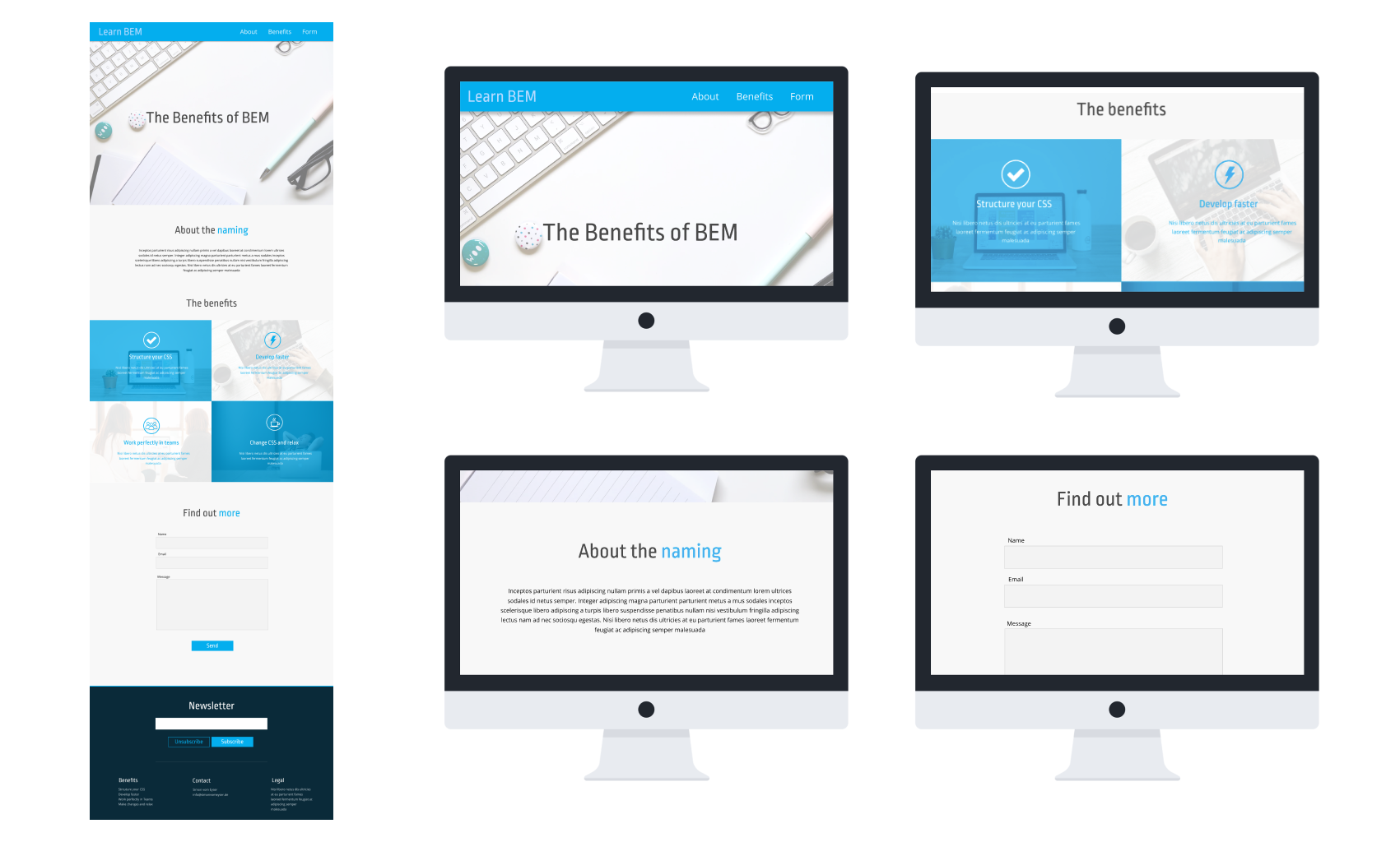
To make things a bit more easy, you can look at the Design in Figma . You can inspect the elements for colors there and export the images if you want to use the assets I used in this design. For that, you need to sign up for a free Figma account though. Just do it, Figma is pure awesomeness.
If you want to be old school, here is a jpg of the design for you to download.
We will start with the header in the next chapter and work our way through the content section to the footer in the other chapters.
This very article is an introduction only
I will cover only the BEM basics and why structuring your CSS is important at all. If you want to dive right in the implementation stuff of the design above, jump to the second Part where we put our pedal to the metal.
Why structure your CSS at all
I am not sure at which point in your career we two are having this odd, one-sided conversation. Chances are that you are just starting out and getting your feet wet in web development land.
You are maybe wondering, "why structure your CSS at all?"
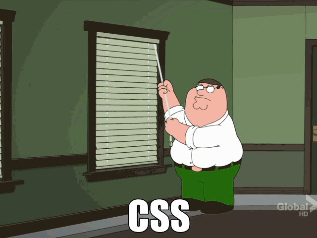
This GIF pretty much sums it up: Even in small Projects your actions always seem to have unexpected results. Or like this joke puts it:
Two CSS Selectors walk into a bar. A bar stool in a totally different bar falls over.
Without a structure your styles somehow always seem to grow into a monolith containing all the rules, one overwriting the other, you sitting in a corner being afraid of any change requests by a customer.
The cascading nature of CSS seems to add layer upon layer of complexity always resulting in something that looks good from the outside, but everybody is afraid to touch. Just like your mom.
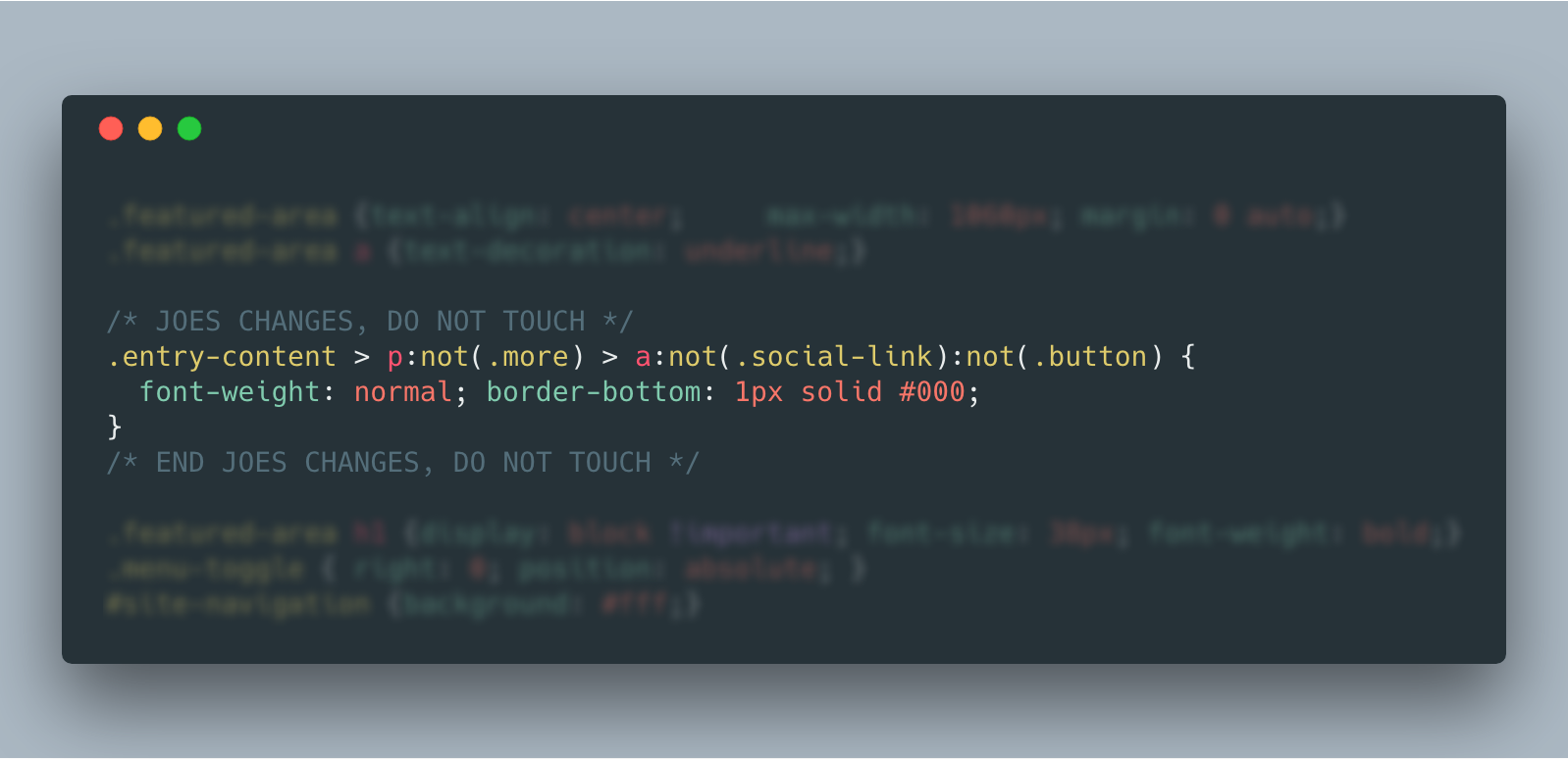
Would you dare to make changes to Joe's CSS on line 6857? Me neither. But don't blame him, he got way better. I hope you agree that the example above is no way to live your life. So we need structure in our CSS. And sorry about the "your mom" joke earlier.
The current state of CSS Structuring and why to choose BEM
There are many ways out there to structure and use CSS in a project. Just look at all the colorful possibilities:
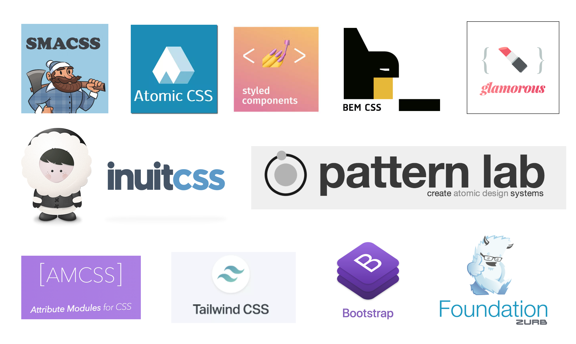
All these are not necessarily comparable, some are Frameworks, some are concepts, some include build systems.
But they all have one thing in common: They scare and confuse the hell out of beginners. If you are at a stage where you don't know how to start I have a rather pragmatic answer for you: Just use BEM as I will show you. This will give you a solid bang for your buck, and you will later see similarities in almost every concept. Other reasons I would advise you to start with BEM:
- It is a really easy approach you can start using today,
- No setup, just simple HTML and CSS knowledge required
- Battles Specificity problems quite well
- Lessens your fear of changing things later
- It's a good segway into component-based thinking like in React
- The more maintainable CSS will prevent you from Voodoo curses of future developers
BEM BAM BEM?! Let's finally start!
So after all this advertising, what the hell is BEM? In all its simplicity, the core concept is to structure your website into modules, meaning reusable parts.
These are called Blocks, the B in BEM. A block should be something encapsulating its own styles and not being depended on its surroundings. So at the end, you should be able to drop a block anywhere on your site or even other sites, and it should look exactly the same. If you ask me, that's a little idealistic, but the core concept is really helpful.

A block gets a simple, descriptive class name, for example like newsletter for styling a newsletter form. Since in this tutorial everything is about practical examples, here we go: We will now build the following newsletter block really quick:
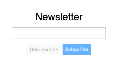
Given this image we could start with the following markup:
<div class="newsletter">
    <div>Newsletter</div>
    <input type="email">
    <button>Unsubscribe</button>
    <button>Subscribe</button>
</div>
Nothing more than a classname. That's dead simple, right? Inside of a block, you will have Elements. These are (most of the time) direct children of a block. To show that they belong to the block, their classname should now be the blocks name and then their own, connected by two underscores.
So class="newsletter__heading" thereby means the Element Heading is inside of the Block Newsletter. Not that complicated right? We end up with the following markup:
<div class="newsletter">
  <div class="newsletter__heading">
    Newsletter
  </div>
  <input type="email" class="newsletter__input">
  <button class="newsletter__button">Unsubscribe</button>
  <button class="newsletter__button">Subscribe</button>
</div>
This looks a little verbose and this is what some people don't like about BEM. If you ask me, it's really reasonable, and you can understand at a glance what hierarchy is at play here.
If you wrap the elements in divs or place the class name on them (like with the input) depends wholly on the context, both is possible.
The last part of the puzzle is to explain how Modifiers work. These can be attached to elements (or blocks) to alter their appearance. In our example, and since we are dirty spammers that want people to subscribe, we want the second button to stand out more. We will add a modifier class like so.
<button class="newsletter__button">
    Unsubscribe
</button>
<button class="newsletter__button newsletter__button--call-to-action">
    Subscribe
</button>
It's important to combine the original class, and the modifier class even if it looks a bit ugly (insert "your mom joke" here) .
This has a host of reasons but to keep it short: No CSS duplication, more semantic markup and benefits of a higher specificity should be enough reason to endure a markup that is a little more verbose.
For the CSS you should create a file containing all the blocks CSS and name it like the Block. So this content should go in a newsletter.css
.newsletter {
  text-align: center;
}

.newsletter .newsletter__heading {
  font-size: 2rem;
  margin-bottom: 1rem;
}

.newsletter .newsletter__input {
  display: block;
  width: 100%;
  padding: 10px;
  margin-bottom: 1rem;
  min-width: 300px;
}

.newsletter .newsletter__button {
  padding: 0.5rem;
  color: #c0c0c0;
  background: #fafafa;
  font-size: 16px;
}

.newsletter .newsletter__button.newsletter__button--call-to-action {
  background: #74B9FF ;
  border-color: #74B9FF;
  color: white;
}
Wohoo! We did our first frontend work using the BEM naming convention. You can find the whole example in this codepen:
There are a lot of things we could discuss this isolated example already, but this will happen in the next post. Just to warn you in advance:
In my opinion, if you use BEM or name all your classes like Lord of the Rings characters (I actually saw that once) does not matter all that much for your client. But for maintainability it's important that you have a system. I like BEM and it helped me in all kinds of projects.
My approach will be really pragmatic and if you like it, we will have a great time. So let's start, everybody ready?


 Say hello!

How to test static pages automatically in Laravel
I developed a way to automatically crawl and test big parts of your Laravel application.
With just one line of code, you can now write a "peace of mind" test that gives you a lot of confidence.
Your Tool is not the Problem - Your Workflow is
A few (meta) thoughts on the search for the best project management tool.
Usually, the chaos you'll find in a software is a quite accuarate representation of your teams' communication skills - and also a big chance for improvement.